All the constancy of blue combined with the energy and excitement of red.
This year, Pantone announced a brand new color to the color pantheon, Veri Peri. The association’s Laurie Pressman, vice president of the Pantone Institute, said the group’s members felt they had to come up with something special and something that expressed all the feelings and moods associated with 2022, a year that people hope will signal a new beginning. So, rather than choose a color from the institute’s extensive palette, they create a brand new color, Pantone 17-3938, Very Peri.
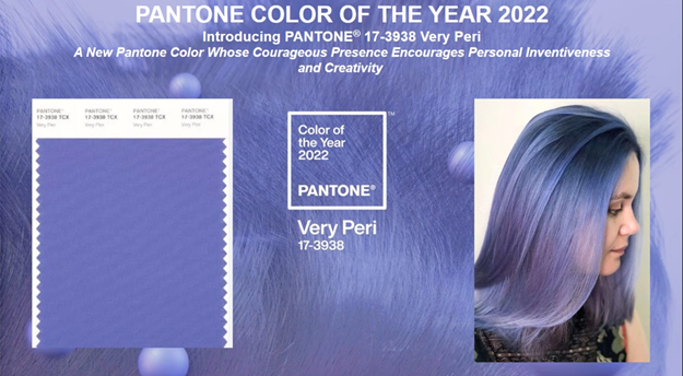
Yeah, it’s purple, but a very nice purple. According to Pressman, “Very Peri is the happiest and warmest of all the blue hues.” She says it combines the constancy of blue with the energy and excitement of red.
The Pantone colors of the year offer a theme of colors for designers and its influence is evident through the year. Pantone’s color experts do not go into this color-picking business lightly. The institute describes it as a years-long process that has the institute’s color experts traveling the world and looking for color influences. They are on the alert for emerging trends and draw from films in production and traveling art collections. The team checks out new artists, design trends, social media, and they pay attention to popular travel locations.
Then, twice a year, the institute hosts secret meetings in selected European capitals, and representatives from color standards groups gather to share presentations and debate to choose a color for the following year.
One of the elements the organization highlighted about Very Peri for 2022 was that it’s a color that suits itself to the digital realm as well as the physical. Pressman says that while Very Peri lives happily in the digital world, it’s also a color that appears frequently in nature. She refers to it as a bridge color that can connect different realms. Pressman talked about the heavy influence of digital in our lives over these two years of pandemics. She said that in their discussions the panel wanted to highlight the importance of digital in our modern lives. She also noted that designers couldn’t always go out on the town to pick up the zeitgeist, they often had to search online for inspiration.
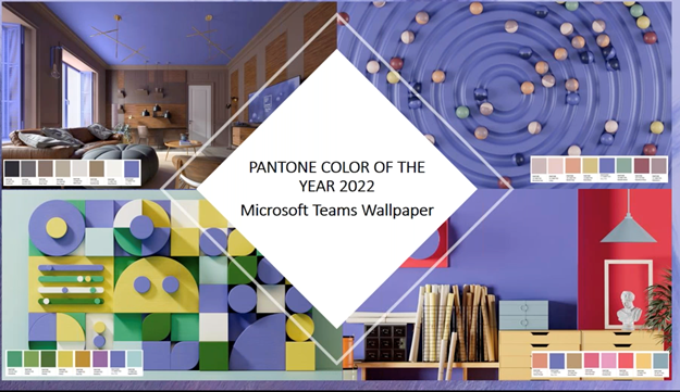
The digitality of the Institute’s choice is being seconded by Microsoft and Adobe. Microsoft has adopted the four color palettes featuring Very Peri for PowerPoint templates, Windows 11 themes, for Teams, and for its Edge browser. Adobe has also introduced new color palettes and, in cooperation with Pantone, makes the palette available in an .ASE file that can be used in Adobe applications.
Pantone suggests four color collections to complement Very Peri for 2022: Balancing Act, Wellspring, the Star of the Show, and Amusements, which should cover everyone’s taste for color combinations.
Balancing Act is a subtle lineup of colors that are complementary to Very Peri and feature warm and cool tones.
Wellspring is a “holistic and harmonious blend of nature-infused shades.” In her presentation, Pressman mentioned that recent years have inspired designs that incorporate nature in its themes. Wellspring supports that urge to bring nature into the house, onto the computer screen, or incorporated in wardrobes.
Star of the Show showcases Very Peri against classic colors and neutral tones. These color combinations add up to a message of timeless sophistication, says the site’s website. If you’re interested, this is the one I gravitated to for home design.
Amusements is a collection of themes that let the pink out and also the orange, yellow, and tourmaline. It makes all the other color combinations look just a little too tasteful and subdued. Just remember, if you’re working on a design you plan to live with for any length of time, Amusements might get on your nerves like a new puppy or a Katy Perry song.
What I always enjoy when the new colors are unveiled is suddenly seeing those color combinations pop up everywhere. Obviously, you can’t unleash a color on the world without getting the buy-in from artists and designers not to mention the collaboration of paint makers, printers, and fabric designers. The discussions have been going on behind our back for years so we can see the results all at once in 2022. It’s the kind of conspiracy I like.
What do we think?
I wasn’t much impressed with Very Peri as I watched the Pantone webcast. Truthfully, I never am when I first see the new color. What, purple again? And, the presentation itself was far from slick. Pressman was obviously holed up in her apartment with computer, earphones, and microphone but stray noises from the street and from nearby construction interrupted the presentation, which eventually turned out perfectly. There are things in this life we can control, and how we use color is one of them but there are constant interferences coming from outside and from the jabbering of online voices to remind us we’re never totally in control. Surprise is always at the heart of creativity. Pressman said the watchwords for 2022 are Courageous Creativity and that’s exactly what we’re hoping for.