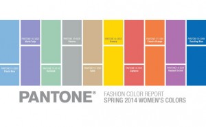
Just in time for your Christmas shopping, the Pantone Institute announces its Spring color palette for 2014.
Who picks your colors? Did you honestly think you did? Did you think you suddenly work up and said to yourself, you know what I need, I need a pair of persimmon slacks? Well, you did not. You had help. The little color elves went into their cave and the white smoke came out, and we have our color palette for spring. This spring is going to be colorful, but also sophisticated. Pastels will be set off by bright, vibrant colors.
Who says? Pantone says. The company has made itself the arbiter of color and provides its color matching system, which enables designers to speak the same language. You don’t want an orangey color, you want Pantone 17-1360 Celosia Orange. Twice a year, Pantone proclaims their color palette for design and they anoint a color of the year. The palettes are a guides and predictors. They’re predictions because the colors are chosen by color experts who observe the choices being made by designers around the world. They’re guides because Pantone’s color experts offer ideas on how the palette could be used in fashion and design. Pantone’s color panel makes their pronouncements in time for New York Fashion Week, and the results are published in Pantone View which the company sells to designers for $750. The company issues a snappy downloadable brochure on their site as well.
The palette isn’t a bible, you’re free to continue committing your own fashion crimes or make your own free choices, but it is influential, and you’ll be seeing new box designs, consumer products, and certainly clothes using these colors – or perhaps playing off these colors in ways different than the mainstream designers are suggesting.
Who cares?
It seems a useful public service to talk about the colors for spring as you might be heading out the door to do your Christmas shopping. By this time in the season, many of us are tharn, paralyzed, caught in the headlights. At least if you have to break down and buy someone a sweater, or yet another scarf, you can pick a stylish color.
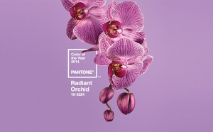
For the brave, the color of the year is Radiant Orchid, and Pantone’s official description by Leatrice Eiseman, executive director of the Pantone Color Institute is as florid as the color: “An enchanting harmony of fuchsia, purple and pink undertones, Radiant Orchid inspires confidence and emanates great joy, love and health.” She says, “it is a captivating purple, one that draws you in with its beguiling charm.” I know. It sort of stops you dead in your tracks doesn’t it?
But honestly, who wouldn’t love Radiand Orchid?
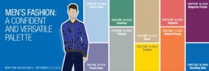
There is a slightly modified palette for men, which has both bolder and brighter colors and includes a wimpy old fall back, Placid Blue, a nice light blue that will go fine with khaki er, Sand but could be jazzed up with a dash of cayenne. A safer option for purple is also offered in the muted Purple Haze.
These colors are already appearing in in new logos, box designs, games, and even furniture. Artists and designers have to stay ahead of the curve and not wait to be told what colors to use, but at least the rest of us can get a clue as to what’s coming down the pike.