FMX conference provides a showcase for animators who take chances.
The founding theme of the FMX conference in Stuttgart is special effects, but as the conference has evolved, driven by the energy of the students who attend, and the creativity of industry professionals and developers, it has expanded to recognize the contribution from all forms of art and the role of technology innovation.
Looked at one way, the art of film effects has its own genre in animation; animation is the purest expression of effects. In live action movies, the animation is a hidden element to make the impossible look real. The animation is more often an adventure into the unreal.
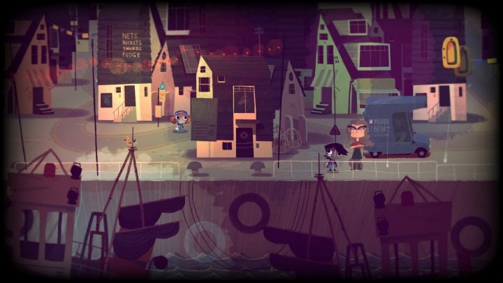
| Rex Crowle’s new game Knights and Bikes was developed for the mobile market. Crowle created a 2D world for the game, which was then developed in Unity. It’s set in Cornwall, where Crowle’s lives—a naturally beautiful area but its inhabitants have few economic opportunities. All that gets into the game. (Source: PlayStation Blog) |
Rex Crowle has been on the tech talk circuit to promote his new company Foam Sword founded with collaborator Moo Yu. Their newest game is Knights and Bikes for PlayStation 4. Crowle is a hero of the independent/alternative game developer world. He was the creative director for Media Molecule’s Tearaway and worked on LittleBigPlanet and Ratchet and Clank by Sony Interactive Entertainment as a gameplay programmer. Knights and Bikes is just coming to the market and is a personal project set in the region he’s lived in all his life, Cornwall. It follows two little girls who are trying to uncover the story behind the region’s myths. Crowle says he wanted to capture the power of imagination, which is what the girls use to enrich the bleak towns they navigate on their bikes.
Crowle said he become drawn to the idea of paper after working on LittleBigPlanet and created Tearaway about an alien messenger creature made of paper. It’s very cute and it explores 2D and 3D as paper flattens and folds to come to life. Tearaway was developed for the PS Vita because Crowle said he wanted to experiment with touch as a gaming input.
In his talk at FMX Crowle showed how he came to his ideas for Knights and Bikes, filling sketchbooks with drawings and color studies and game set ideas. He was able to translate those drawings into assets for Knights and Bikes. which he developed with Yu, who also worked with Crowle on BigLittlePlant and Ratchet & Crank. Crowle points out that the Yu, based in Anaheim, is in some ways unimaginably far away from Cornwall, but that his perspective formed by a place dominated by theme parks brings a different dimension to the game. And maybe this distance isn’t all that great. Both places depend on the tourist trade and the game lives squarely in the imagination.
As he has with his past work, Crowle experiments with his artwork and the intersections of 2D and 3D. Created in a 3D engine, Unity, with 2D assets. The game has depth but there is also a social aspect to the work Foam Sword has done in Knights and Bikes. The main characters are girls whose parents are facing real-world problems inherent in the region. Crowle told the audience, that he had created bad games in his career because he didn’t have anything to say with the game. With Knights and Bikes Crowle says he wanted to share his part of the world. The game is set, sort of, in the 80s when Crowle was growing up. He notes that the 80s didn’t come to Cornwall in the same time frame that it came to richer, more developed areas. It came a little later and had a distinctive Cornish flavor. He said he constrained the look and action of the game to the point of view of his cute frenetic little girls. He played with the animation timing and drawings to create a fizzy look to communicate the crazy energy of his characters. The game lives in their world view and their imagination. Finally, Crowle said he also wanted the game to be enriched by collaboration. Players can play alone, but they can also share and work together with other players. He said he loved how BigLittlePlanet was a game that mothers often played with their children and that is was a shared experience.
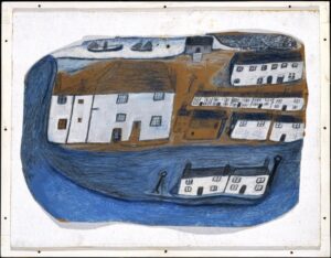
The style of the art was inspired by artist Alfred Wallis, a Cornish man who spent much of his life in the region working at the same occupations as the people in the game, in scrap metal, fishing, selling ice cream to tourists. The game has also inspired a comic book based on Crowle’s artwork, but with its own stories for his characters. Crowle admits he loves reading about his characters, and seeing what they get up to beyond his game.
| St. Ives by Alfred Wallis. (Source: Creative Commons) |
The session was a reminder of how much amazing game development is going into mobile development thanks to the riches that have flowed from Fortnite but also the possibilities for games in different mediums.
VR experiments
On another front, and from another cultural aesthetic, Jan Pinkava who was born in Prague shared the opening keynote stage with VFX Supervisor Danny Dimian from Spider-Man. Pinkava, who is best known for directing Pixar’s short Geri’s Game Pinkava. He also developed the concept and co-directed Pixar’s Ratatouille with Brad Bird. He has said that his work has been influenced by the work of Czechoslovakian animators who redefined the art in the golden age that spanned from the 50s to the 80s. That evidence is particularly evident in Ratatouille.
Pinkava has gone to Google Spotlight Stories where he is helping develop interactive shorts. The team is experimenting with VR to use it as a compelling storytelling vehicle. It’s tricky.
The Age of Sail directed by John Kahrs was showcased this year at FMX (and also at the Venice Film Festival). It’s a sweet story: crusty old sailor voiced by Ian McShane, sweet uppity girl in distress by Cathy Ang. Crusty guy finds redemption. The artwork has a stark, almost cutout look to go with the isolation of the sea. Unfortunately, there seems no reason for it to be VR because the story all takes place dead center, so why look around? Why don the headset at all. Also, the filmmakers do not give the story enough time to unfold probably because they were conscious of the short time most people will tolerate VR.
Pinkava made Piggy for Google Spotlight Films with Mark Ofdedal. It relies on a simple, charming hand-drawn little piggy who encounters a cake on his jog. Pig resolutely jogs away from temptation, jogs back, jogs around the object of his obsession, and again jogs away. Pinkava says the action in Piggy is different depending on where the viewer is looking. Do you follow the pig, do you protect the cake. With Piggy, the filmmakers set themselves the task of directing the viewer in subtle ways. In an interview at the View conference in Italy, Pinkava said his little pig is self-conscious so he’ll never eat the cake while he is being watched. Luckily the piece is charming and short.
In order to follow the pig, the viewer wearing a VR headset has to turn their head far to the left and right (or stand up and physically turn, which would be more comfortable, if not convenient). Sometimes it’s irritating, where did the pig go? Sometimes it’s funny, oh! there he is. As Pinkava says, in comedy timing is everything, but in VR the viewer controls the timing.
It’s tricky.
Pinkava talked about how art and technology drive each other. While at Pixar, he said, he made Geri’s Game to explore the use of human characters in animation. As an aside, it’s been twenty years since Pinkava made Geri’s World, as he’s aged, he looks like Geri and his talk reinforces how personal animation can be for the animators.
Geri’s Game is the story of an old man’s game of chess in the park. It’s a character study. Up to that time, Pixar had not done much with expressive human faces, and Pixar President Ed Catmull gave the job to Pinkava. At FMX Pinkava addressed the theme of Bridging the Gap, and asked what gap? He told the audience that the artists at Pixar lived to push boundaries. He said Pixar’s animation chief John Lassiter said art challenges the technology and art inspired the technology. But so far, art is having a hard time meeting the challenge of VR.
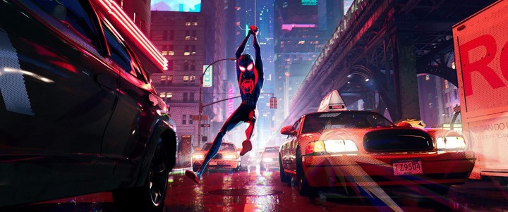
| Down these mean streets goes Spider-Man. Spider-Man: Into the Spider-Verse successfully bridges the gap from comic book to big screen. (Source: Sony Pictures) |
FMX has always highlighted the expressive artwork that can be created in the movie industry, but Spider-Man: Into the Spider-Verse isn’t an edgy European film or a personal artistic expression, it’s a full-blown mainstream hit that takes chances in its art and pushes the conventions of classic animation. It’s an affirmation that innovation thrives in Hollywood (against all odds). The story introduces a new Spider-Man hero to the movies, Miles Morales, a city kid inducted into the Spider-Verse in the usual fashion, by a spider bite. The Miles Morales Marvel comics first introduced in 2011, were created by artist Sara Pichelli and writer Brian Michael Bendis. The different character and theme helped free the filmmakers from the now long-established conventions of the Spider-Man movies. The Spider-Verse is already a multi-dimensional concept that accommodates alternative universes, and Spider-men unbound by the time and physics. Fittingly, the film has multiple directors: Bob Persichetti, Peter Ramsey, and Rodney Rothman from a screenplay by Phil Lord and Rothman and an army of 140 animators.
Danny Dimian, special effects supervisor for Into the Spider-Verse told the FMX audience that they had to fight for their ideas with Sony Pictures. For instance, the team committed early on to eliminate motion blur, which is pretty much animation heresy but, says Dimian, as they conceptualized the look and feel of the movie, they wanted to force themselves to consciously address movement and style and not fall back on convention. They opted for a half-tone look for shading and Dimian wanted to reinforce the hand-drawn look and the animators adopted added elements like motion lines and used classic animation techniques like stretching and squashing characters and scenes to enrich the emotional effects. Their primary tools were Autodesk Maya, Foundry’s Nuke, and Katana, tools created specifically to get the distinctive look of this film. The final color grading was done in DaVinci Resolve.
They also experimented with the traditional animation technique of animating on twos, meaning moving every other frame. For this version of Spider-Man, the animators varied their approach. As Miles learns to use his Spider-Powers he is animated on the twos, and as he’s being mentored by Peter Parker who is animated on the ones, his movement is noticeably slower. As he learns, his movements become more smooth because he is then being animated on the ones as well. (And the reason for all those animators becomes even more clear.)
All this is cool, and often ineffably subtle. What’s undeniably wonderful is the look of the film. The film gives the comics a light and intensity of color that’s unobtainable on typical comic book paper. The characters are not bound by their environment they’re powered by it.
The wonder of animation is that it’s always renewable, always fresh. It’s stretchable, squashable, beautiful, and terrible. At FMX artists are able to show how much story can be told in the arc of a line. What was so interesting this year is where the personal stories came together. How the artists created unique visions for their stories and used standard tools in new ways.
There has never been a doubt that 2D is forever, has there? What’s been interesting over time, is how 3D engines have provided animators with so much more power and freedom.

