New drafting tool for tablets bridges conceptualization and drafting and opens up new lines of communication for professionals.
The arrival of touch and tablets is changing many worlds, but the CAD industry is certainly one of the largest markets seeing fundamental shifts as a result of new platforms and interfaces. We tripped over the Concepts drafting tool by TopHatch at Adobe Max in Fall 2014. We certainly weren’t looking for it, but the product is a revelation. TopHatch, headed by founder and CEO Ben Merrill and CTO David Brittain, puts a new spin on drafting and conceptualization. Their first product Concepts, which is available for free on iOS, is a product that bridges Design and CAD. It allows users to freely sketch and then they can apply dimensions, straighten up lines, add details, to create an exact CAD drawing for construction or manufacture. The company’s philosophy towards conceptualization is described in this video on YouTube.

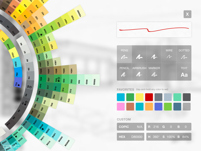
Concepts is suitable for professional workflows. It can export to Adobe’s PSD with layers, and also SVG, Autodesk’s DXF, JPEG, and PNG. The company worked with Adobe’s SDK to support PSD and also enable Adobe Cloud subscribers to access their content for use in Concepts and store their work on the Creative Cloud for use in Adobe products such as Illustrator, Photoshop, or InDesign to name the obvious synergistic programs. True to their designerly bent, the developers have adopted the Copic Color System which was devised to help designers pick colors that will go together. The Copic Color system was developed as a support tool for the Copic line of markers made in Japan and sold in the U.S. by Imagination International, Inc. It’s sort of like a periodic table for colors with a number system as well as relationship arrangement on a scale. It’s really pretty too.
The free version of Concepts is remarkably capable with the ability to set scale, draw to dimensions, sketch, use layers, styles, etc. Users can add more tools with in-app purchases. For what it is, it’s crazy cheap.

Concepts has broad pen support including Adobe Ink, Adonit Jot Touch, Wacom Finepoint and the Wacom Intuos Creative Stylus 2.
As is so typical in this age of apps, Concepts is evolving rapidly. This small, driven team is constantly upgrading the software and they’re building it with input from customers and CAD professionals. We talked with Evan Bronstein, senior architectural project designer at Kuhlmann Design Group in St. Louis, who was an early beta tester for Concepts. He is an Instructor in Architecture at Maryville University and the Center for Creative Arts in St. Louis. Bronstein is passionate about the creative process and about the ways in which tools can help the process or get in the way. He says, “the touch interface has allowed a more intuitive, tactile connection between the user and the medium.”
More important, says Bronstein, the arrival of tools like Concepts is also helping heal the divide between older professionals trained in traditional methods of design and drafting and their younger counterparts. He says, “the relationship with technology is far more congenial now than it ever has been. And as a complement, the technology is also beginning to yield to the user. We have to adapt less and less to technology as it is finally coming to us.” And, he adds, “the arrival of tablets and pens enables mature professionals and interns to work together more comfortably using a medium they both embrace.”
There has been a visceral longing in the CAD industry for some way to return to drawing as the first means of expressing ideas. Microsoft’s Michael Gough, who championed pen input at Adobe (and is now working in Microsoft’s ASG group), says exactly the same thing: humans want to draw and digital tools enable them to draw better.
A key to the strength of Concepts is that once you’ve drawn a line, or circle, or rectangle, whatever, it’s still editable. So for instance, you can hold the pen down on a line and it comes back to life, it can be adjusted according to a specific dimension, straightened, etc. Concepts also allows users to select a group of circles, lines, arcs, and make adjustments. The ideas you work out in a free form flow can be captured, cleaned up, and even imported into a CAD program.
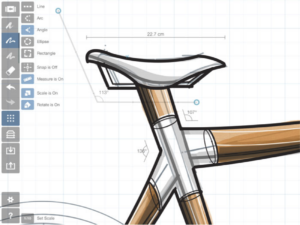
But, there is a catch, there is always a catch. The interface is tricky. I found it hard to move between the different modes – freehand vs. precision. That’s because Concepts wants to enable a fluid workflow, but it takes a while to figure out what “state” you’re in. As you can see in the image of the bicycle, choosing the grid gives you precision tools. The ah-ha moment came when turning off precision mode revealed drawing tools. This is just one example, and perhaps not a great one, because anyone committed to learning the app (and surely anyone who has ever learned a CAD app), will get this down. The larger point is that there needs to be more documentation of what’s going on and the people at Concepts are racing to improve the manual and to add more helpful videos for users.
In the meantime, users have to be determined to get the most out of Concepts but they’ll be rewarded.
What do we think?
The 2D drafting world has been dominated by tools that try to recreate AutoCAD and steal that market from Autodesk. It’s not a bad business plan, especially on paper, but the message bubbling up from schools and makers and young professionals is that there need to be a brand new paradigm to fit new platforms and different workflows. What I find fascinating about Concepts and frankly, what I have been slow to realize, is that new tools have to be grounded in established, accepted practices. This is what the people at TopHatch are trying to do.


