More from Adobe Max: Adobe XD, Dimension, and Spark apps.
This year Adobe Max was held in Las Vegas. Executive VP and General Manager Bryan Lamkin told the audience that this year the company is rolling out the biggest upgrades ever for its flagship products and a range of apps with the broadest appeal ever. We covered Lightroom CC in a previous post. This post covers Adobe XD, Dimension, and Spark apps.
The unifying thread of the apps unveiled this year is their suitability for a wide range of users. They reflect a trend in Adobe’s development. Shantanu Narayen said that people in the user community can expect to see Adobe’s tools leveraging backbone capabilities such as Sensei, the cloud, creative cloud libraries, and probably more cool stuff being cooked up in the labs.
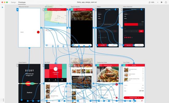
XD is a prototyping tool for websites and applications that Adobe’s teams to put together an entire site with all pages developed to whatever level of detail is desired, interactivity can be literally wired up, with transitions. Changes can be made globally. Most interesting, I think is the way XD is taking advantages of new features in Adobe’s flagship tools. For instance, and forgive me if I get too specific here, but XD allows a designer to create a row or column of thumbnail buttons, for instant, and to get going the artist might shove in a place holder photo in all of the thumbnails, further down when the photos for the buttons have been created, developers can line up all the images at once and, drop them on the row of thumbnails, and boom, they’ll fill the spaces sequentially. This was a fabulous new feature in illustrator and InDesign years ago, but that doesn’t make it any the less fabulous in this application and it is an example of Adobe leveraging its ingenuity across its applications. (In fact, as some of you may know by now, we’ve been building a brand new JPR website; seeing this feature made me cry because we didn’t have it.)

Dimension is dear to this writer’s heart because it answers a longtime desire—to use 3D in art despite the fact, I don’t have the patience to learn 3D modeling. Adobe introduced Project Felix last year and the crowd was delighted. Felix has been renamed, the interface has been tuned up, and Adobe is offering a wealth of materials with their new standard format Adobe Standard Materials. The format is built on Nvidia’s free MDL material format which is being widely used in the industry. Adobe Dimension supports the OBJ model format, which is also a broad industry standard for content creation software. The company is also offering models and materials through Adobe Stock. New materials can be developed with Allegorithmic’s Substance Painter and captured using Adobe Capture. The underlying rendering engine for Dimension is based on the V-Ray ray tracing engine. Compositions put together in Dimension can be exported to Photoshop with all layers intact, enabling further editing and fine turning. It’s a tool designed for Adobe’s customers, with a workflow that integrates well with the company’s product line, but it’s also a tool that fits into a broader industry ecosystem. Customers can help build stock libraries, add to the materials library, and create their own models to share or sell.
Right now, Adobe put its early efforts into creating a tool to create realistic product shots and explore packaging options. It gives designers the ability to prototype a photo shoot or even create their own marketing work. Given the right set up—meaning, what you want to do fits into the current parameters of Dimension’s features it enables people to do work in minutes instead of days or hours. Specifically, Dimension is now best suited for placing products on a reflective surface in an environment. There are a lot of companies that want to do just that and will revel in the ability to save money. Stefano Corazza, Adobe’s Senior Director, Engineering at Adobe has been instrumental in the development of Dimension. He came to Adobe with the acquisition of Mixamo in 2015. He sees much more opportunity for Dimension for artists, in publishing, advertising, etc. In addition Corazza is working with Adobe’s team of developers exploring immersion. At Max this year Adobe made it clear that immersion is going to be an important future direction for the company. Later on CTO Abhay Parasnis said tools like XD, Dimension, Premiere and other apps will be part of the ecosystem for creating immersive content.
Spark is another new tool with intriguing possibilities. Introduced several years ago as a storytelling tool for voice, images, and type, it was fun but it cried out for more capabilities, especially video and more formats. The product introduced at Max comes a long way from the cute voice tool, which was pretty adorable. (It even seemed to smooth out the user’s (my) voice for narration and connected pictures.) Spark today is so much more. It has been developed to enable anyone to pull together branding, video, images and type to create a variety of pieces for social media, ad creation, and presentations. Aubrey Cattell has joined Adobe as GM and senior director for Spark. Previously, he was in business development at Autodesk and oversaw the popular apps like Sketch and Pixlr. Cattell says Spark is a powerful story-telling platform and says Adobe is seeing the program being used by students to create and present reports, business professionals delivering more dynamic presentations, artists packaging their portfolios, and marketers positioning their products with dynamic pieces for the internet.

With Spark, Adobe enters new territory, the basic version is free and it is cloud based. It offers users a number of templates to use to put together a social networking post, an interactive email, web page, or story. The premium enables people to create marketing pieces with consistent brands, colors and text styles. It’s part of the Creative Cloud subscription or can be purchased for $9.99 a month or $99 a year.
Playing around with Spark is totally fun. It’s interesting too, to see what colors Adobe picks out to go with your brand and what colors you might already be using or prefer. It seemed to me that this year that the color palette at Max had a lot of pastels, it’s a color trend that’s been around for a while and sure enough Adobe Spark added pastel accent colors to my JPR branding. However, it’s easy enough to create your own palette and Adobe will play along, without making any comments about taste. Creations can be made and shared, but in these early days of experimenting I found it hard to share brand templates with other people; It may be that we have to have Adobe team to do that. (I’m awaiting answers). Also, Spark seemed to make its own decisions about how text was sized and defaulted to all caps for text. The ease of use in these early days comes from a willingness to do it Adobe’s way, which isn’t bad, it’s just not my way, or your way.
Spark is also another example of the way in which Adobe has managed to learn from earlier efforts. InDesign has a similar publishing application for stories, and so had Adobe PDF even longer ago. They have been variations on flip books, or slide shows, etc. With Spark, Adobe takes another stab at presentation and offers something easier to use. You can really see that it’d be fun to be able to insert 3D objects a la Dimension. And it offers great tools for creating a beautiful web page. You’re likely to be seeing it in our web pages, however, Adobe seems to be determined to keep its claws in. It’s possible to download creations as JPEGs but that’s static. Instead, Adobe prefers you use a link to post on social media. It’s gratifying because eyeballs and likes are registered, but it’s annoying if you’d rather not share credit for your work with Adobe. There may be plenty of workarounds; fiddling around with Spark on a Saturday afternoon hardly qualifies as in-depth testing.
See part 1 here.


