This year’s Adobe Max conference switched from technology previews and corporate overviews to a focus on what Adobe customers are creating. But there was still plenty of news.
By Kathleen Maher
Adobe changed up their annual Adobe Max conference this year and focused on their customers rather than on their technology. In the past, the conference has been presented by Apple CTO Kevin Lynch and often concentrated on major shifts in technology.

This year Adobe senior VP David Wadhwani did the honors with a kickoff by Shantanu Narayen, a man who is not a flashy CEO but he is among the most courageously visionary people in Silicon Valley. Wadhwani, likewise, has seemed pretty dry in the past, but he has done some work and his performance was warm and engaging. More important, though, Adobe put the spotlight on creative people and their work.
A lot of this seems driven by the company’s recent acquisition of Behance, a social media site for creatives where people can collaborate and share their work. Behance lets people upload their portfolios and get tips, but also get voted up or down depending on the quality. The focus is clearly on the professional. Behance CEO Scott Belsky told the audience that he and Adobe supported the idea of creating a meritocracy for artists where people could be credited for their work and, more importantly, get paid. Behance hopes to help the best artists rise to the top. Adobe figures out 3D
We thought the glorious, stupendous opening for Adobe Max was significant, even if it did delay the festivities for 20 minutes or so. When it finally happened it was worth it: bright 3D projections swirled around a wraparound set to give a feeling of immersion. Maxon has teamed with Adobe to integrate Cinema 4D into After Effects. In a chance chat with Paul Babb, CEO of Maxon U.S., he tells us he’s seeing more people who were already using 3D tools to work with After Effects switching to Cinema 4D, but he thinks it’s going to take a bit longer to get people who don’t use 3D tools to try them out, even if they’re included in After Effects for free.
Adobe has been trying to figure out how to give its customers 3D capabilities without building its own 3D application. Meanwhile, Maxon has committed its resources to integrating its Cinema 4D 3D application with Adobe’s After Effects. It looked like Adobe is very happy with its strategy for 3D.
The cloud is everything
Not all users are quite so happy with Adobe right now. Narayen announced that future Creative Suite products would no longer be sold as perpetual licenses. Instead they’ll be sold on a subscription basis, and they won’t be called Creative Suite products, CS, they’ll be called Creative Cloud products, CC. The pricing will stay the same: the same painless introductory price of $29.99, which goes up to the slightly more painful $49.99. Also, Adobe will extend the backwards compatibility of the cloud products—at least from CS 6 onward. At Max, where the faithful were gathered, Adobe’s announcement went over reasonably well. Longtime users seem to like the Creative Cloud. We talked to several people whose businesses depend on the Creative Cloud, and they’re taking the news with equanimity. In fact, for the most part, people have seen this coming. They just didn’t see it coming so soon.
The people we talked to, representatives from advertising agencies, web portals, and other creative houses, said they welcome the standardization of the Creative Cloud. Most admitted they’d be paying more for Adobe’s products under the license, but they also felt they were getting a lot more. Out in the world, however, there is much weeping, wailing, and gnashing of teeth. There is even a Change.org petition calling for Adobe to please put back the option to buy perpetual licenses.
It’s unclear whether all these people actually use Adobe’s products, but they’ve got opinions nonetheless. We notice, too, that Corel likewise has an opinion. Corel and Quark both have taken the opportunity to reiterate their products’ availability as boxed products.
Adobe foray into hardware
Adobe’s biggest surprise came as it unveiled the work it’s been doing in hardware. The company demonstrated a new pen design, a ruler, and a digital white board for magazine production.
The pen and ruler were developed through Project Mighty, which was demonstrated working on an iPad. The giant layout tool was developed through Project Context and looks like a Surface application. The pen is triangular in shape and comfortable, and it seemed perfectly easy to use. The pen includes memory to remember people’s settings and preferences and also to be able to draw, erase, and redraw. It’s also tightly integrated with Adobe Cloud, and it can pull in stored Kuler color palette themes and stored assets. In this case you really do have everything at your fingertips—as you move from device to device, the pen remembers what you were up to.
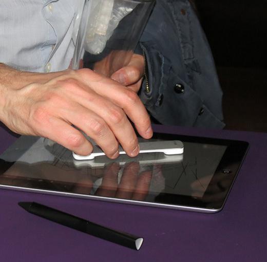
The pen has a companion in Napoleon, a ruler that can be used as a reference point for lines and arcs. Michael Gough demonstrated the new Project Mighty tools on the Max stage. He was clearly proud of what the Adobe developers and their partners have accomplished. One of the things that Adobe has tried to do with its new input devices is to return to a more natural feel to the process of drawing without leaving behind the advantages of digital tools like copy and paste. The pen fosters the use of two hands in drawing, just like people do with paper—you can erase with your other hand or turn the “paper,” and of course you can manipulate the ruler. The pen has an LED on its tip to give users information about what’s available to them.
I talked to Geoff Dowd, senior experience design lead at Adobe, who told me the pen is capacitive because pens pretty much have to be to work with the iPad, but he notes instead of the rubber bullet point used by most styli for iPad, Adobe engineered the smallest rubber tip they could. He says, “It was quite an effort! Striking the balance between hitting Apple’s iOS technical requirements of a touch and perceived accuracy, we have a great tip.”
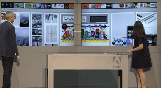
Adobe worked with industrial design firm Ammunition to design a pen that feels good in the hand and draws well—I really did like it, and as a left-hander, that’s usually not the case for digital pens. MindTribe handled the electrical and mechanical engineering. Context is a little more out there. It’s a resource-heavy, digital version of layout boards and tables. I was surprised that anyone still works this way, though it does look like a luxury, too. Context combines large vertical LED screens to show the pages as if they were hung up on the wall—just like it used to be in the old days—and also a flat table to let people lean in. All the screens are touch-enabled to let users flip through pages or even “throw” them from screen to screen.
Tech Crunch’s Frederick Lardinois talked to Adobe’s David Macy, who let it slip that the team was also thinking about creating a table much like that you’d see in an architect’s office, so it won’t surprise you to hear that some people on the team including Michael Gough have a background in architecture.
Project Context is clearly the result of thinking big. It’s not for every publication, but the work these people have been doing could easily translate to other applications and slightly less huge and expansive form factors. But we were pretty jealous of Wired’s resources (see photo above).
Our take
We are seeing the beginning of a new generation of computing and eventually a new human. We are going to be continually documented, we’re filming each other, we’re captured by security cameras, we’re commenting on it all as if someone actually gave a damn, and we’re even keeping a pretty close watch on our internal functions with Fitbits and Fuelbands, and more is on the way.
Software buddies like Adobe and Google are giving us tools to take all this information and post it or turn it into applications and movies and magazines. The first mutation has already happened, we don’t really care about personal privacy.
Adobe’s ideas for hardware aren’t really new—they tap in to the longing that people have had ever since the computer came along and made us start drawing with rock-shaped mice instead of pencil and paper, but it’s the really simple things that are sometimes the most revolutionary. Too bad we’re probably going to have to have a few rounds of pen wars before we get something that will be universally useful.
Probably the best part of Adobe Max was the part I didn’t even mention: the focus on the work artists are doing. Do yourself a favor and watch Erik Johansson’s presentation (below) to see how art is mutating right along with us.


